Digital guides for a more thoughtful writing practice.
Telvor · Fountain pen writing & calligraphy
Make a little room for writing by hand.
Explore the comfort of a regular fountain pen, the character of italic letters and the pleasure of a finished handwritten note.
3 digital guides
292 planned pages
PDF · nothing shipped
The idea
Begin with the pen you understand.
one thing at a time
Writing and calligraphy share a page, but not always a technique. TELVOR helps you distinguish everyday pen control, broad-edge lettering and composition, with a clear place to start for each.
The guides
Three guides. One price for each.
Choose the part of your practice you want to develop.
£19.99Every individual guide is the same price — pick by what you need, not by what costs less.
EVERYDAY
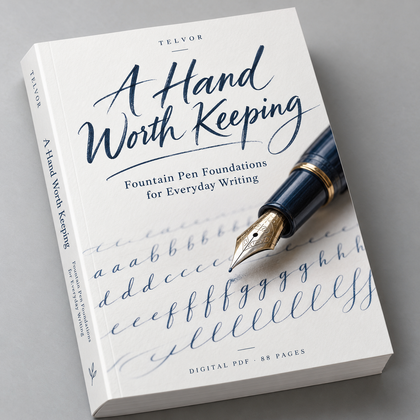
A Hand Worth Keeping
Fountain Pen Foundations for Everyday Writing
Make everyday writing feel more deliberate. Learn to choose suitable materials, use a light touch and practise strokes, spacing and rhythm with a regular fountain pen.
You will need: A regular fountain pen
ITALIC
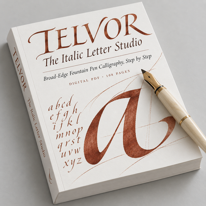
The Italic Letter Studio
Broad-Edge Fountain Pen Calligraphy, Step by Step
Explore italic calligraphy with a broad-edge fountain pen. Build consistent angles, letter families and word spacing through a clear sequence of practice.
You will need: A broad-edge, italic or stub nib
COMPOSITION
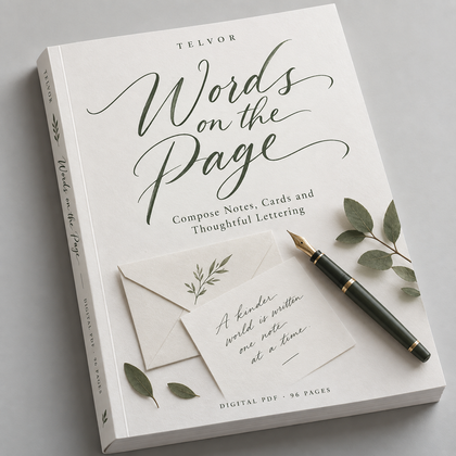
Words on the Page
Compose Notes, Cards and Thoughtful Lettering
Give your handwriting somewhere to live. Plan notes, cards and personal letters with thoughtful spacing, hierarchy and restrained decoration.
You will need: Any pen — everyday hand or italic
A sample lesson
One page from each guide.
Short lessons with an exercise at the end — this is how the guides read throughout.
EVERYDAY
Let the Nib Do the Work
A normal fountain pen is not a flexible calligraphy nib. Aim for a light touch and a comfortable angle rather than pressing for thick strokes. Begin with slow lines and small ovals. Pause if the pen feels scratchy or your hand tightens.
Try thisFill three short rows with light lines, ovals and loops. Notice where your grip becomes tense.
ITALIC
Keep the Angle Consistent
Italic calligraphy uses a broad edge to create contrast through direction. Keep the nib angle consistent as you move. Do not add pressure to imitate a flexible nib. Start with short strokes and compare the result before moving to letters.
Try thisMake a row of short strokes with a broad-edge fountain pen. Compare their width and your pen angle.
COMPOSITION
Leave Room for the Words
Plan a short message in pencil on scrap paper before writing the final version. Give the main line space to breathe. Keep supporting words smaller and leave clear margins. A restrained layout can make ordinary handwriting feel considered.
Try thisLay out a five-word message three ways: centred, left aligned and with a small heading.
The collection
From the first stroke to the finished note.
Bring all three digital guides together in The Telvor Pen & Page Collection: 292 planned pages covering foundations, italic and personal projects.
- A Hand Worth Keeping88 pages
- The Italic Letter Studio108 pages
- Words on the Page96 pages
£48.99
All three guides added to your basket · three separate digital PDF ebooks.
Outcomes
What your practice can include
- 01Choose a comfortable pen and suitable paper.
- 02Use a light touch with a regular nib.
- 03Build consistent broad-edge angles.
- 04Explore italic letter families.
- 05Give words room through spacing and layout.
- 06Finish notes, cards and personal letters.
Look inside
A closer look at the practice.
Browse the contents and sample lesson for each guide. Readable explanations and space to practise help you understand the approach before you choose.
EVERYDAY
A Hand Worth Keeping

Contents

Sample lesson
ITALIC
The Italic Letter Studio

Contents

Sample lesson
COMPOSITION
Words on the Page

Contents

Sample lesson
Our story
A small practice, with something to say.
Iris Bennett is the voice behind TELVOR, and she represents a patient approach to the page: understand your pen, make time to practise and put your words to use.
Digital delivery
Your writing practice, in a digital guide.
Every title is a PDF ebook for a compatible computer, tablet or phone. You may print practice pages for personal use. Book-style product images are visual previews; no physical writing supplies are included.
- Digital PDF ebooks
- Printable practice pages, for personal use
- No pen, ink or paper is shipped
FAQ
Before you choose.
Are these printed books?
No. Every TELVOR guide is a digital PDF ebook. No physical items are shipped.
Are they suitable for beginners?
Yes. Each guide starts with its own foundations, and the three roles are distinct.
Can I use a normal fountain pen?
Yes for A Hand Worth Keeping. The Italic Letter Studio needs a suitable broad-edge, italic or stub nib. Words on the Page can be used with everyday handwriting or italic.
Do I need to press hard for thick strokes?
Do not force a normal nib to flex. Broad-edge contrast comes from the nib shape and stroke direction. Follow your pen’s instructions.
What ink should I use?
Use ink explicitly suitable for your fountain pen and follow the manufacturer’s instructions. Do not assume dip-pen ink is compatible.
Are these brush lettering or Copperplate guides?
No. They focus on regular fountain pen writing, broad-edge italic and composition.
Do all individual guides cost the same?
Yes. Each ebook costs £19.99.
What is included in the collection?
All three separate digital PDF guides, with a planned total of 292 pages.
How will I receive the files?
After purchase, downloads are delivered through the store’s digital-delivery system.
Can I print pages?
You may print selected pages for personal use. Do not share or resell the files or printed copies.
What is the refund policy?
Please read our Refund Policy for the terms that apply to digital purchases.
Start here
Your next line starts here.
Choose one guide or bring the full writing sequence together.
Digital product noticeDigital PDF ebook. Book-shaped images are visual previews. No printed book, pen, ink or paper will be shipped.
Pen, nib and inkDo not force a normal nib to flex; broad-edge contrast comes from the nib shape and stroke direction. The Italic Letter Studio needs a suitable broad-edge, italic or stub fountain pen. Use ink explicitly suitable for your fountain pen and follow the manufacturer’s instructions — do not assume dip-pen ink is compatible. These are not brush lettering or Copperplate guides.
TELVOR — Give your words a little more care.
Digital PDF products. No physical items shipped.